Training a decoder-only model for font generation
Welcome to this technical deep dive on how Fontweaver’s model was trained to generate fonts. The goal here is to share and source more ideas from the community.
Preface
I was heavily inspired by this post 1 and this paper 2. Thank you to all the type designers who patiently answered my beginner questions.
The basics of fonts
To understand font generation, the first step was to learn font creation. The first thing I learnt was how to build one. After speaking to a few type designers, I got recommended this beautiful book called “Designing Type” by Karen Cheng. In the book, it goes through all the history behind typography, different styles and characteristics of a font, and a character by character breakdown. It’s quite extensive, and I would recommend to typography virgins md9myself.

Fonts possess numerous characteristics. From the well-known differences like sans vs. serifs and font weights to more nuanced details such as terminal types (balled, bracketed, slabs, rounded), stem weights, stress (angle of slant), aperture (how open a font is), and x-height (height between the lowercase ‘x’ and capital ‘X’). All these differences and help the font become unique and allow them to be useful in different contexts. A sans, vertical, open font can be good in websites for readability and modernity. A serif, bold, closed font could be useful in branded products giving and vintage feel.
Desribing a glyph
Font files come in many formats, but each glyph is comprised on 6 basic commands on a 2d grid. The following are command definitions from fontTools, the library I used to parse font files.
- moveTo - Moves the point
- lineTo - Draws line from current point to new point.
- curveTo - Draw a cubic Bézier with an arbitrary number of control points.
- qCurveTo - Draw a whole string of quadratic curve segments. 3
- endPath - End the current sub path, but don’t close it.
- closePath - Close the current sub path.
Deciding on the type of model.
At the start in my mind, the model architecture can go in 2 fundamental directions. 1, a diffusion approach - where we are denoising or 2, an autoregressive approach. In the end, I chose the latter. This was mainly because of complexity. This is my first foray into training a somewhat big and so a simpler design with more online resources would suit me well. With an autoregressive model, we can easily consider our textual prompt as input text tokens (using BERT or similar) and consider each path command as a token. Aside from each command as a token, we will also use the PAD (padding), EOG (end of glyph) and glyph character. The text token comprises characteristics of a font generated by Gemini.
For the font with the name font_name, please give me the following attributes comma-delimited, in one line, without headers, and all in text. Aperture, Weight, Terminals, Serifs, Stems, Stroke contrast, Axis, Stress, 5 adjectives
Data parsing
For each font file, I created tensors of the following format. The idea to have 2 glyph in sequence is to allow each glyph to learn from the past one. The extreme case is to have full attention on all past glyphs, but our VRAM is the limiting factor here.
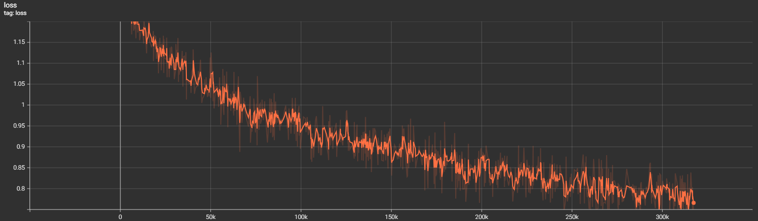
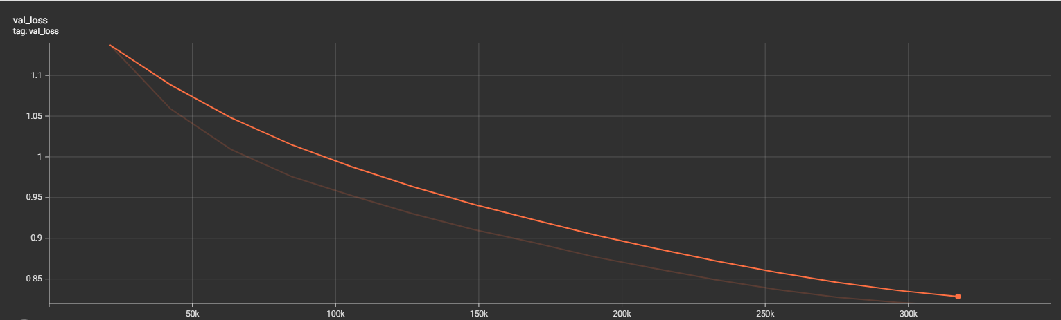
Training results
The model was trained for 17hrs on a 4 x L4 machine. I did not pursue much tuning and used an AdamW optimizer with a CosineAnnealingLR schedule.
Actual results
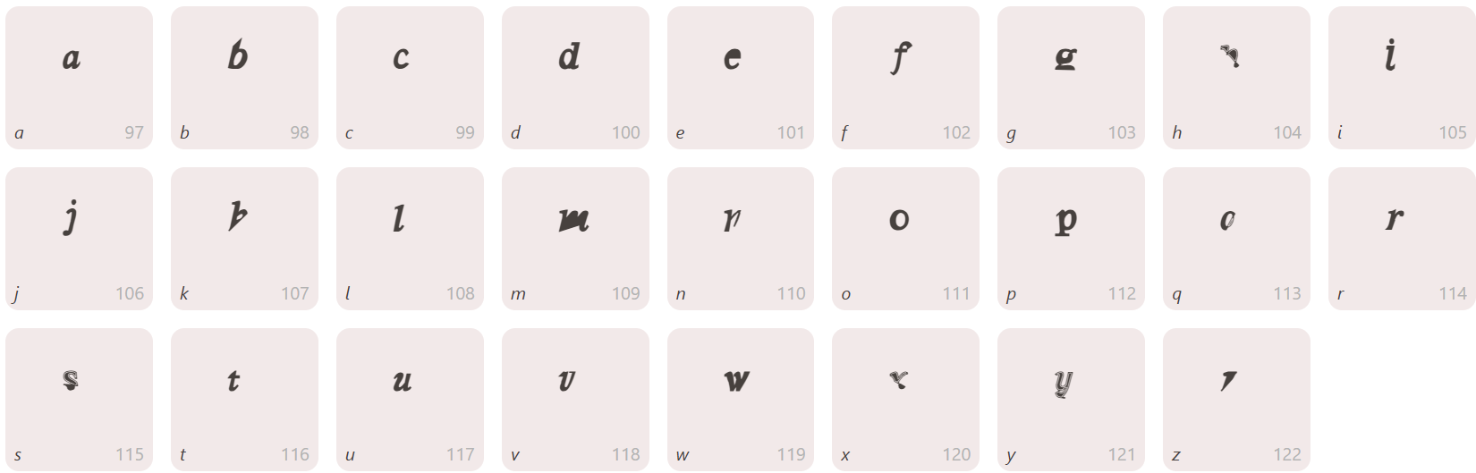
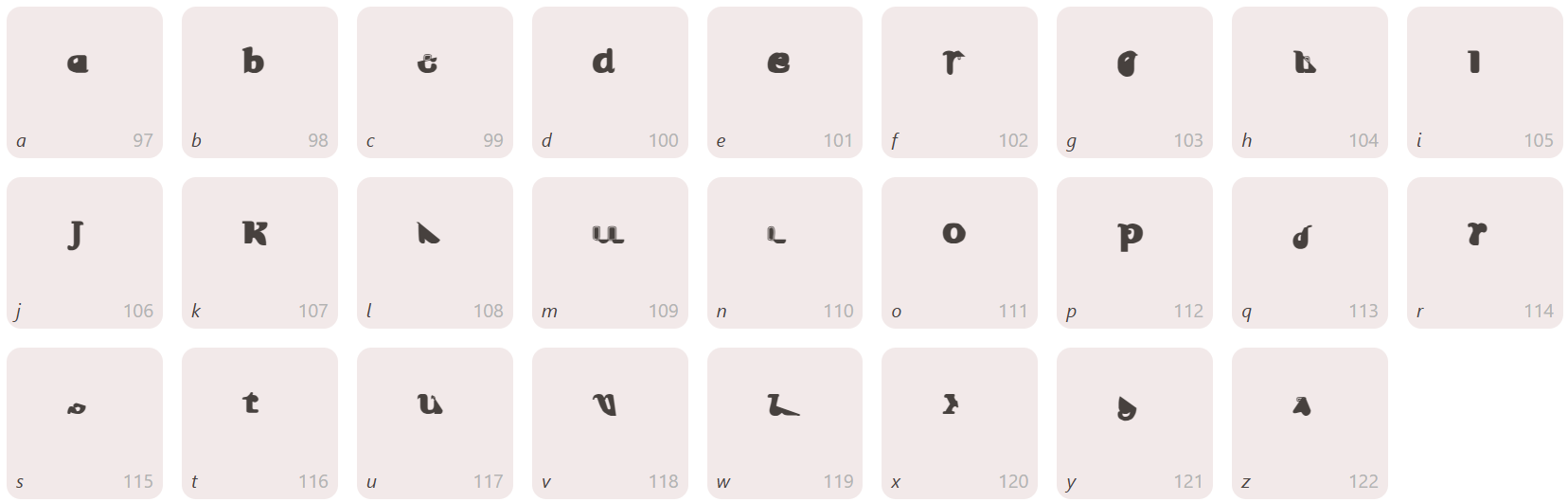
The model (try now for free) generally produces salient glyphs but do abruptly fail on some glyphs. I’m working on improving the generation as we speak.
What next?
Based on the current feedback, there are a 2 main new features I want to build.
Glyph filling - Right now the user flow is designed for ideation. A user can test out different styles quickly to get a good blueprint to start but the output is always based on past tokens. This means if you supply text prompt + A + B > C. However, what if a designer has already drawn D or H. Can we use these to guide the generation? This type of filling in the blank is possible via casual masking 4. Perhaps the right way to think about it is that a whole font is like a big image and each glyph is a component of that image.
Support for CJK (Chinese, Japanese, Korean) fonts - Being Chinese myself (who also knows a bit of Japanese) this is a feature I would personally love. This is much more difficult because of the combined lack of existing examples with a larger glyph set. My current thinking is to split individual characters by its strokes so once the model learns what each stroke looks like, you can reconstruct characters. This is similar to Q9 typing input, but I’m not sure if there is specification on positioning of strokes in a glyph. A bigger deviation would be to consider using diffusion models 5 6.
Footnotes
[2] IconShop
[3] Bézier Curves fundamentals
[4] CM3: A Causal Masked Multimodal Model of the Internet
[5] SVGDreamer: Text Guided SVG Generation with Diffusion Model
[6] DiffCJK: Conditional Diffusion Model for High-Quality and Wide-coverage CJK Character Generation